데이터시각화_2 : Seaborn의 기본구조
Seaborn
- Matplotlib을 기반으로 다양한 색상 테마와 통계용 차트 등의 기능을 추가한 시각화 패키지
- 기본적인 시각화 기능은 Matplotlib 패키지에 의존하며 통계 기능은 Statsmodels 패키지에 의존한다.
- 함수가 쉬우며 직관적으로 결과를 확인할 수 있다.

03. 데이터시각화(seaborn)
파이썬 데이터 시각화 라이브러리 중 하나인 [Seaborn](https://seaborn.pydata.org/index.html)에 대해서 살펴보겠습니다. 
- 환경변수 설정 함수 : set 함수는 스타일, 팔레트, 글꼴, 글꼴 크기 등 플롯의 그림에 영향을 준다.
- seaborn.set(context, style, palette, font, font_scale, color_code, rc)
- Parameter
- context: 배율조정
- style: {None, 'darkgrid', 'whitegrid', 'dark', 'white', 'ticks'} 중 하나
set_style
- 틱스타일만 변경
- figsize :그래프 크기
- hue : 컬럼명 기준으로 데이터 색깔 구분해줌
- col_wrap : 한 줄에 몇개의 그래프를 그릴지
- palette: 색상 컨셉 지정
- scatter_kws : 점의 색깔, 투명도 등 속성 지정 s=점의크기, alpha= 투명도
- ci : 신뢰구간
- height : 높이조절
- https://seaborn.pydata.org/tutorial/color_palettes.html
- https://seaborn.pydata.org/tutorial/aesthetics.html?highlight=style
Controlling figure aesthetics — seaborn 0.11.2 documentation
Drawing attractive figures is important. When making figures for yourself, as you explore a dataset, it’s nice to have plots that are pleasant to look at. Visualizations are also central to communicating quantitative insights to an audience, and in that
seaborn.pydata.org
Choosing color palettes — seaborn 0.11.2 documentation
Components of color Because of the way our eyes work, a particular color can be defined using three components. We usually program colors in a computer by specifying their RGB values, which set the intensity of the red, green, and blue channels in a displa
seaborn.pydata.org
<같은 자료구조를 가지고 스타일만 변형시킨 예>
sns.set_theme(style="ticks")
plt.figure(figsize=(20, 20))
sns.lmplot(x="x", y="y", col="dataset", hue="dataset", data=df, ci=False,
col_wrap=4, palette="muted", height=4, scatter_kws={"s": 100, "alpha": 0.7});
plt.show()
plt.savefig('lm.png')
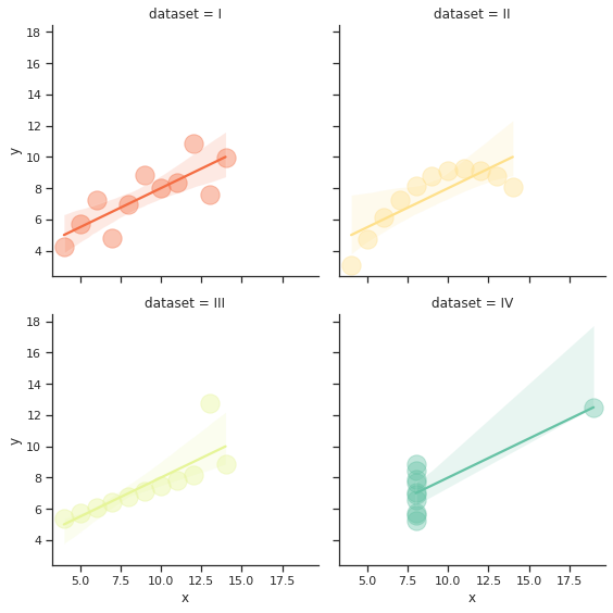
sns.set_theme(style="ticks")
plt.figure(figsize=(5, 5))
sns.lmplot(x="x", y="y", col="dataset", hue="dataset", data=df,
col_wrap=2, palette="Spectral", scatter_kws={"s": 300, "alpha": 0.4});
# ci = True일때는 생략가능
plt.show()
plt.savefig('lm.png')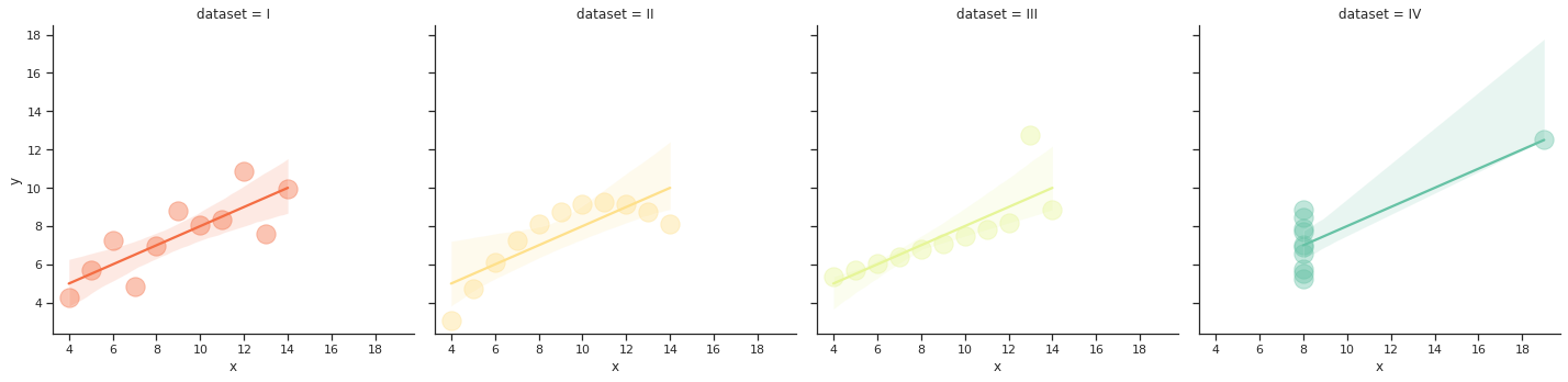
- height의 차이가 헷갈려서 위의 그래프와 모든 값을 동일하게 하고 height만 추가해보았다.
sns.set_theme(style="ticks")
plt.figure(figsize=(5, 5))
sns.lmplot(x="x", y="y", col="dataset", hue="dataset", data=df,
col_wrap=4, palette="Spectral", height = 10, scatter_kws={"s": 300, "alpha": 0.4});
# ci = True일때는 생략가능
plt.show()
plt.savefig('lm.png')
-height와 col_wqrp을 더 조정한 예
sns.set_theme(style="ticks")
plt.figure(figsize=(5, 5))
sns.lmplot(x="x", y="y", col="dataset", hue="dataset", data=df,
col_wrap=2, palette="Spectral", height = 4, scatter_kws={"s": 300, "alpha": 0.4});
# ci = True일때는 생략가능
plt.show()
plt.savefig('lm.png')